News - Horological Society of New York News - Horological Society of New York Horological Society of New York

This post is part of a series, Reading Time at HSNY, written by our librarians. Today’s post was written by library intern Freddy Thompson.
The Horological Society of New York (HSNY) has a wonderful library full of books on everything from escapements to celestial navigation to the Loch Ness monster (yes, really), but did you also know we have significant archival holdings, too? While books (and a few of our more bookish blooks) can be neatly cataloged and arranged on the shelf by their Library of Congress call numbers, archival items can be a lot trickier. These items can range from exhibition flyers to diaries to T-shirts and jigsaw puzzles (all real examples in HSNY’s holdings), so they need to be broken up into categories and described in finding aids. One of the biggest collections we have within the archives is our brand catalogs, and it’s been my job these past few months to organise and describe them. I have a fondness for archival arranging, no matter how dull the materials, but this particular collection has taught me more about the history of watch and clock advertising than I thought there was to learn, so I thought I’d share some highlights with you.
What is a Brand Catalog, Anyway?
In short? It’s a big ad.
Bulova’s Spring 1980 catalog and (one of) Swatch’s 2010 catalogs. Much like comparing a Great Pyrenees and a Chihuahua, you’ll have to take my word for it when I say these are the same species.
Brands release these periodically — often once a year, sometimes once a month, or (for brands going for a fashion angle) seasonally — to show off their current products. Sometimes they have prices — whether printed directly into the catalog or in an attached supplement — but sometimes they don’t. If you have to ask, you can’t afford it (and it might be sold for different prices in different markets).
Physically, they tend to exist somewhere on the continuum between “booklet” and “magazine”, though some of the bigger ones look just like a book, and some of the smaller ones are flimsy enough to approach the pamphlet label. What separates them from a leaflet or a brochure or another form of advertising is usually just their size and extent — we definitely have a few gray areas, but I tend to make the call that a brand catalog must be showing off more than one model of watch in order to count. And what separates them from the big showcase volumes of brand watches we have is their manner of publication: our main library room has books with ISBNs that were printed to be sold, whereas the brand catalogs in the archives were printed as advertising material without ISBNs (and sometimes, annoyingly, any identifying information at all).
But as for what’s actually in them: that varies a great deal, and the way that it varies can reveal quite a lot about not just watches and clocks, but the way advertising — and the society it targets — has evolved over the years.
In the Beginning…
Things were pretty simple.
Jerome and Jerome, with a pencil for scale.
Catalogs as a medium came into being around the middle of the 18th century, right as this whole “mass production” thing was starting to kick into gear, but they weren’t super common until the 19th century, where HSNY’s holdings begin. Our oldest catalogs are both from 1852 — one from Jerome & Co. Manufacturers and Wholesale Clock Dealers, Philadelphia, and the other from Chauncey Jerome, Manufacturer of Brass Clocks, New Haven, Connecticut. (Yes, it’s the same Jerome, and his disparate businesses and attributions went on to become the New Haven Clock Co.)
These clocks are Papier Maiche. Do you like that? Does it make you want to buy them? Does it mean anything to you at all? Jerome doesn’t particularly care. He just makes them. 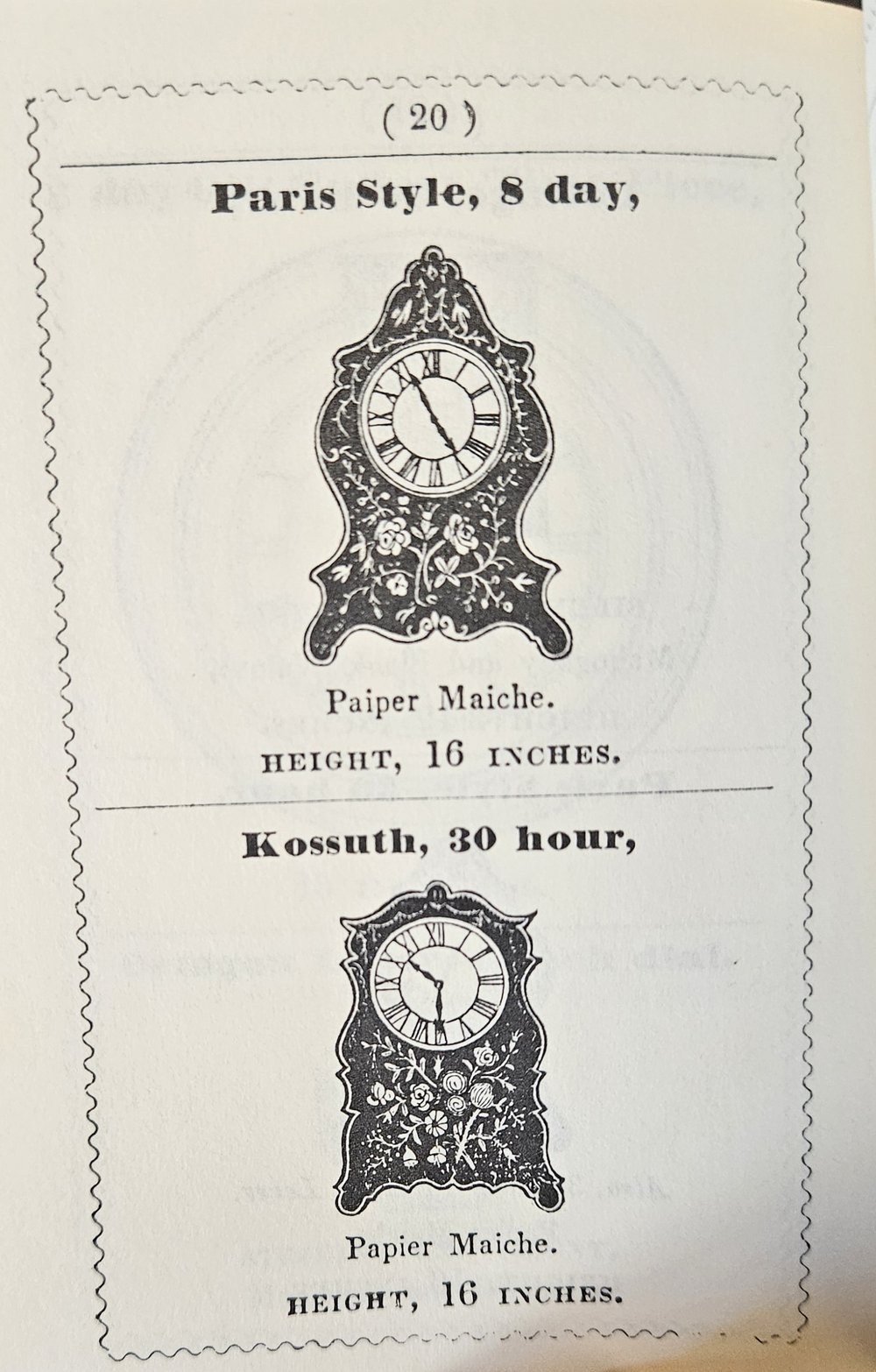
The clocks in this 1874 E. Howard & Co. catalog aren’t just made of black walnut, it’s well-seasoned black walnut, and they’re even well adapted for use in dwelling-houses. No word on other houses though.
These tiny pamphlets were fragile and ephemeral, intended to last for the year and then be discarded. Our editions are 20th-century facsimiles, made to look and feel like the originals, which are now out of print, as is the case for most of our catalogs from before World War II. The illustrations are simple, clear, and head-on — there’s no stage-lighting, there’s no color (in either the images or the copy) — you’re told the basic facts of the clocks. Whether you want to buy one or not is up to you.
As the century progressed, however, catalog copywriters began to realise that they could put some spin on the facts they were stating in order to make these clocks and watches more appealing to potential buyers.
With the limitations on photographic technology, brand catalogs from this era were restricted to detailed illustrations, and — through this limitation — were restricted in turn to purely representational depictions of the products. Techniques like dramatic angles and mood lighting, which appeared later, weren’t yet a good idea. Without photos, customers had to take the seller’s word that their illustration accurately depicted their product. Too much stylization and you risked someone arguing that they didn’t get what they paid for.
Photos
Throughout the first half of the 20th century, photography became possible thanks to inventions like the halftone process, flashbulbs, and the wirephoto. The spread of photography in advertising was not a uniform process — it varied greatly depending on location, culture, and even on the target audience of the ads. For much of its early history, photography was seen as a kind of vulgar tool, and high-end brands (as well as newspapers and magazines) would position themselves as elegant and cultured by making sure all their images were engravings that only referenced photos.
Even when showing off technical information like the workings of this two train chime mechanism, it was seen as uncouth to use a photograph instead of an engraving. Picture from The Herschede Hall Clock Company’s 1923-1924 Hall Clocks catalog.
It didn’t take too long for photography to catch on, though. Even before the post-World War II consumerism boom, American brand catalogs were branching out into photos that did more than just show you what a clock looked like: they were realizing they could show you what a clock meant.
This desk clock is staged with a cigar, so you know it’s good for you.
While engravings aspired to exacting representation without the vulgarity of just being what the thing actually looked like, photographs could capture the surroundings of the product, too. The 1939 Seth Thomas catalog takes advantage of this to stage little settings for many of its featured clocks. Clocks shaped like ship wheels are placed next to model ships to capture the attention of their maritime audience, while ornate, traditional mantel clocks are positioned between fine silver jugs atop a fireplace to attract fancy people who like fancy things.
It’s not until the 1950s and 1960s, however, that things really kicked off.
The Postwar Boom
At the risk of sounding like the first few minutes of Mad Men, the 50s and 60s were a golden age for advertising, and not just in the emerging realm of television. New technologies were changing print media, too — color printing was becoming cheap enough to be viable for advertising material, and with audiences now thoroughly used to interpreting visual media, photos and illustrations were becoming more stylistic and depicting not just the products they were aiming to sell, but the audience they were aiming to sell to.
This spread from the July 1961 Ingraham catalog not only shows off its products in glossy colour, but also invites “homemakers, career girls, coeds, teen-agers” to imagine themselves as the smiling, stylish women drawn alongside them.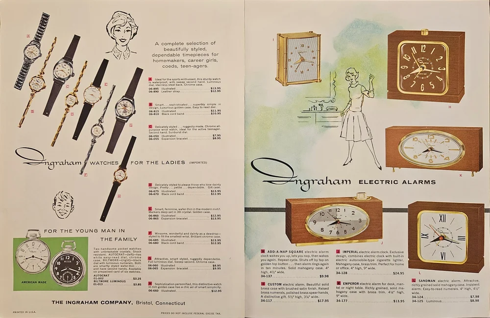
By this point in time, there was big money in advertising, and watch and clock brands were willing to pay up to stand out, but catalogs were still ephemeral pieces of advertising. And color printing may have gotten cheaper, but it was still expensive, so when something went wrong in the printing process companies might not have been willing to completely overhaul the run. This was even true in the case of a minor printing error like the one found in the Alpha Watch Co., Inc.’s 1962 catalog where the colors look slightly offset with the result that the image becomes soft and blurry. But that imperfection allows us to see how these early color photos were printed, revealing how each color print was actually multiple prints — each of a single color — printed over each other.
In an age when the average American was reading color magazines and could even have color TV, it was better for brand catalogs to have imperfect color than risk having no colour at all. 
Even with the pared-down copy in the Alpha Watch Co., Inc. catalog, advertising language is still doing heavy lifting — everything is “acclaimed”, “super” and “guaranteed”, but with improvements in print and photography technology, it wasn’t long before the most effective indication of quality became saying nothing at all.
Quiet Luxury
Depending on the intended audience of the brand, advertising in the 70s could go in many directions. More domestic-oriented brands like Seth Thomas took advantage of improvements in color print and photography to stage scenes of comfort and familiarity, while still extolling their virtues in descriptive and friendly copy. Meanwhile, luxury brands like Bulova — who had always been at the cutting edge of advertising — started to realize that less was more.
Seth Thomas’ 1973 catalog. BYO beer and whittled duck.
Bulova’s April 1977 catalog refuses to ask, let alone answer, any questions about its own products, demanding that the reader seek them out if they want to know more. 
Bulova’s April 1977 catalog includes some copy, but it also includes whole pages of watches identified solely by their model number, against a featureless blue background. The layout demands that the watches speak for themselves, and in a market since saturated with fawning copy, it suggests that the watches have plenty to say on their own. This lack of information places the watches in a privileged position — they know something you don’t. Maybe if you bought one of these watches, you would know something other people don’t.
IWC’s 1974 catalog does more than just objectify women, it also displays an early example of the “luxury gradient” that would characterise luxury watch photography of the eighties and nineties. 
IWC’s 1974 catalog stands at an interesting crossroads. As a luxury brand, it was well and truly positioning its products as something to aspire to. While using human models — whether drawn or photographed — would soon become as gauche as an un-engraved photograph in the 1900s, IWC had beautiful women model some of its featured pieces in this catalog. All of the models specifically avoid eye contact with the viewer. They’re positioned as unobtainable, desirable things — and they’re wearing IWC watches. Maybe if you bought an IWC watch, the women would no longer be unobtainable. There is copy (in German), but it is pared down, back to the bare basics that we saw in early trade catalogs. Yes, the watch is made of 18 karat gold, but it’s up to you to know how good that is.
This trend continued through the end of the 20th century. Brand catalogs became more image-focused, with the photos becoming larger, higher quality, and with a focus on details of the pieces against simple backgrounds. Often these backgrounds were a kind of mood-lit gradient, evoking a kind of evening-wear elegance even for stationary household pieces.
This L’Epée catalog from the mid-nineties (exact date unknown) puts its carriage clocks on a plain black plinth in a mood-lit void.
Turn of the Millennium
All this simplicity and implication is all well and good for the second millennium, but it’s the information age now, and everyone wants to know everything about everything. It’s hard to say when exactly the switch flipped, but technical information is now back in vogue.
It’d be weird to drown this page from Swatch’s 2015 catalog in copy when the watches don’t even have numbered dials, right?
Chopard’s Grand Prix de Monaco Historique 2008 catalog is a celebration of Chopard’s relationship with the Monaco Grand Prix, and its product listings read like the technical specs of a top of the line race car.
Some brands stuck to their stripped-down guns — brands like Swatch present themselves as modern, slick and fashionable, and their 21st-century catalogs still reflect that.
It might be too soon to say — our brand catalogs do only go up until 2019 — but the combined influences of everything from the prominence of sports watches to the profligacy of data about everything in the 21st century suggests that we might be seeing spec-riddled catalogs for a good while to come.